

Research Module
Proprietary Research No Competitor Can Match
Four proprietary scores on every symbol. 100+ key ratios with industry benchmarks and customizable views. Compare up to 6 stocks across every metric. Visual financial analysis for non-finance users. 8 research sub-tabs. 25,000+ companies. AI-powered analysis. The most comprehensive research depth available — and all under your brand.
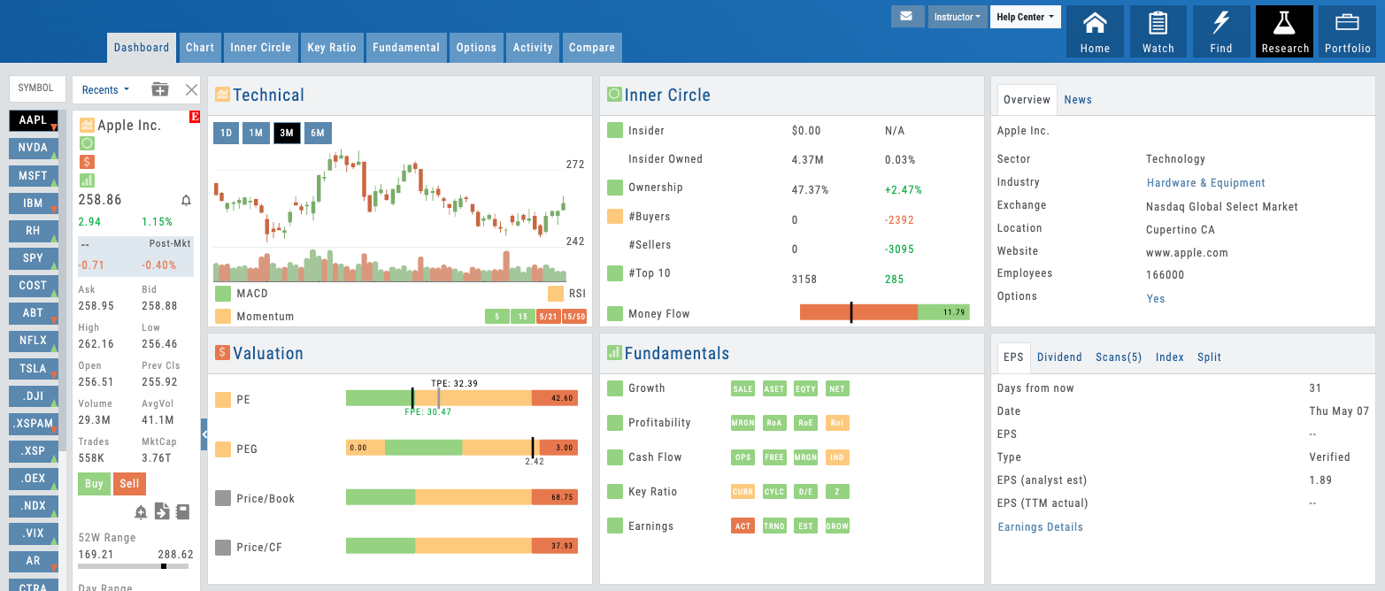
Research Dashboard showing 4 proprietary score quadrants
01 — Proprietary IP
4 Proprietary Scores on Every Symbol
Technical, Inner Circle, Valuation, and Fundamentals — proprietary research depth your competitors cannot offer.
No competitor offers proprietary scores like these. Each of the four — Technical, Inner Circle, Valuation, and Fundamentals — combines data sources and algorithms iVest+ has built from the ground up. They’re the reason your users will choose your platform over anyone else’s.
The Technical Score aggregates momentum, volatility, and trend strength. Inner Circle combines insider Form 4 filings with institutional position changes to show you where the smart money is. Valuation uses multiple methodologies to measure upside and downside. Fundamentals scores earnings quality, balance sheet strength, and growth trajectory.
Every score is clickable. Users can navigate straight to the underlying research view — seeing the exact data, ratios, and benchmarks that generated each score. It’s transparency built in. For partners, this is the ultimate B2B differentiator: you’re offering proprietary research IP that no competitor can replicate. Your users get analytical depth that makes your platform the only tool they need.
- Technical Score — Momentum, trend, volatility at a glance
- Inner Circle Score — Smart money signal from insider and institutional data
- Valuation Score — Upside/downside measured by multiple methodologies
- Fundamentals Score — Earnings quality, balance sheet, growth assessment
- All 4 scores clickable for deep-dive research views
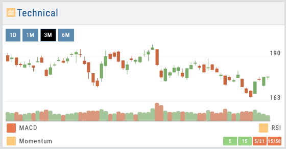
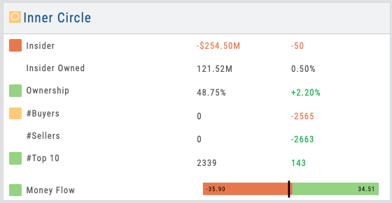
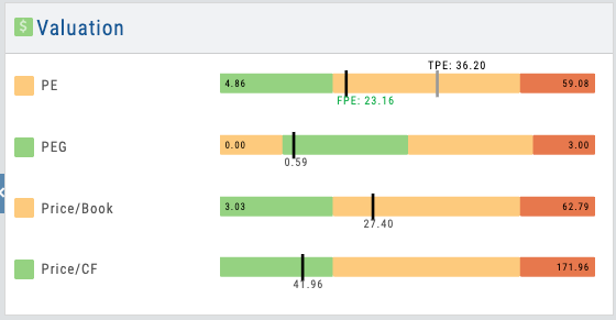
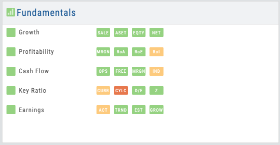
4 score quadrants — Technical, Inner Circle, Valuation, Fundamentals
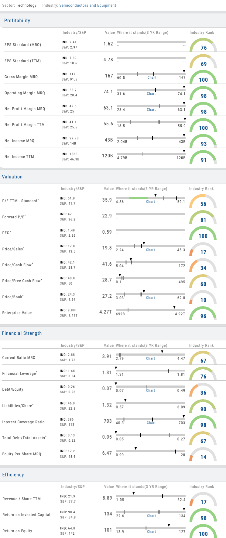
Bullet charts showing 3-year range with industry and S&P benchmarks
02 — Data Depth
100+ Key Ratios with Industry Benchmarks
Organized into 6 data sections. Bullet charts show 3-year range with industry and S&P 500 benchmarks.
The Key Ratios view is where analytical depth becomes visible. 100+ metrics organized across six sections — Valuation, Profitability, Efficiency, Leverage, Liquidity, and Growth. Each ratio appears as a bullet chart showing the company’s current position, 3-year range, where the industry group average sits, where the S&P 500 average sits, and the stock’s percentile rank compared to its industry group.
With 100+ ratios, organization matters. That’s why the platform includes customizable views: Balanced (most commonly used ratios), Swing Trader, Position Trader, and Investor — each pre-configured to surface the ratios most relevant to that style. And here’s the B2B lever: partners can create custom views for their users that align to their specific education or strategy methodology. Your students see the ratios that matter for what you teach, not a wall of numbers.
- 100+ key ratios across Valuation, Profitability, Efficiency, Leverage, Liquidity, Growth
- Bullet charts: current value, 3-year range, industry average, S&P 500, percentile rank
- Pre-built views: Balanced, Swing Trader, Position Trader, Investor
- Partners create custom views aligned to their education and strategies
- Real-time updates from 25,000+ company data pool
03 — Smart Money Signal
Inner Circle — The Smart Money Signal
Insider Form 4 filings combined with institutional position changes. Who’s buying, who’s selling, and at what scale.
The Inner Circle score tracks insider transactions and institutional positioning simultaneously. When executives are buying — or dumping — you see it. When major institutions are accumulating shares or reducing positions, the signal appears. Combined, these two data sources create what might be the single most actionable research insight: the smart money signal.
Insiders know their business better than anyone. Institutions move capital on the highest conviction. When both are pointing the same direction, it matters. The Inner Circle view breaks this down: you see each insider filing, the transaction direction and size, the institutional moves by quarter, and a narrative on the direction. For traders, this is a critical research layer. For partners, it’s a research depth story that resonates with users.
- Insider Form 4 filings with transaction details, dates, and ownership context
- Institutional position changes by quarter with institution names and stake sizes
- Directional summary: buying signal vs. selling signal vs. mixed
- Timeline view showing transaction history over time
- Screens and filters to find matching opportunities across 25,000+ symbols
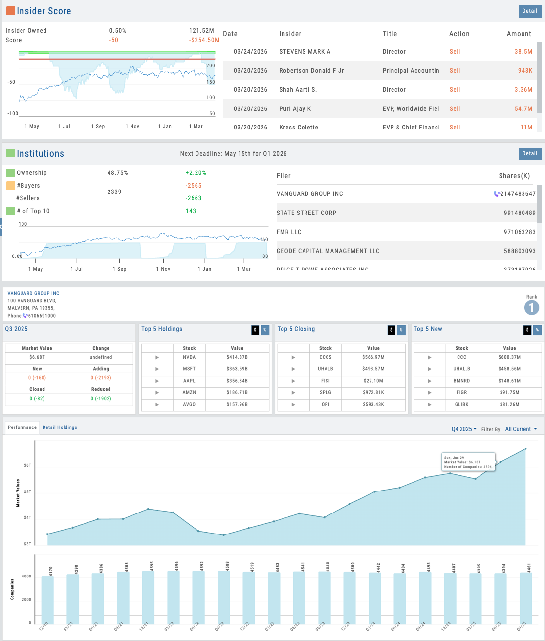
Inner Circle view showing insider filings and institutional position changes timeline
Want to Offer Proprietary Research Under Your Brand?
Four proprietary scores, 100+ key ratios with customizable views, 6-stock comparison, visual fundamentals, and AI-powered analysis — deployed as part of your branded platform. Your users get research depth no competitor can match.
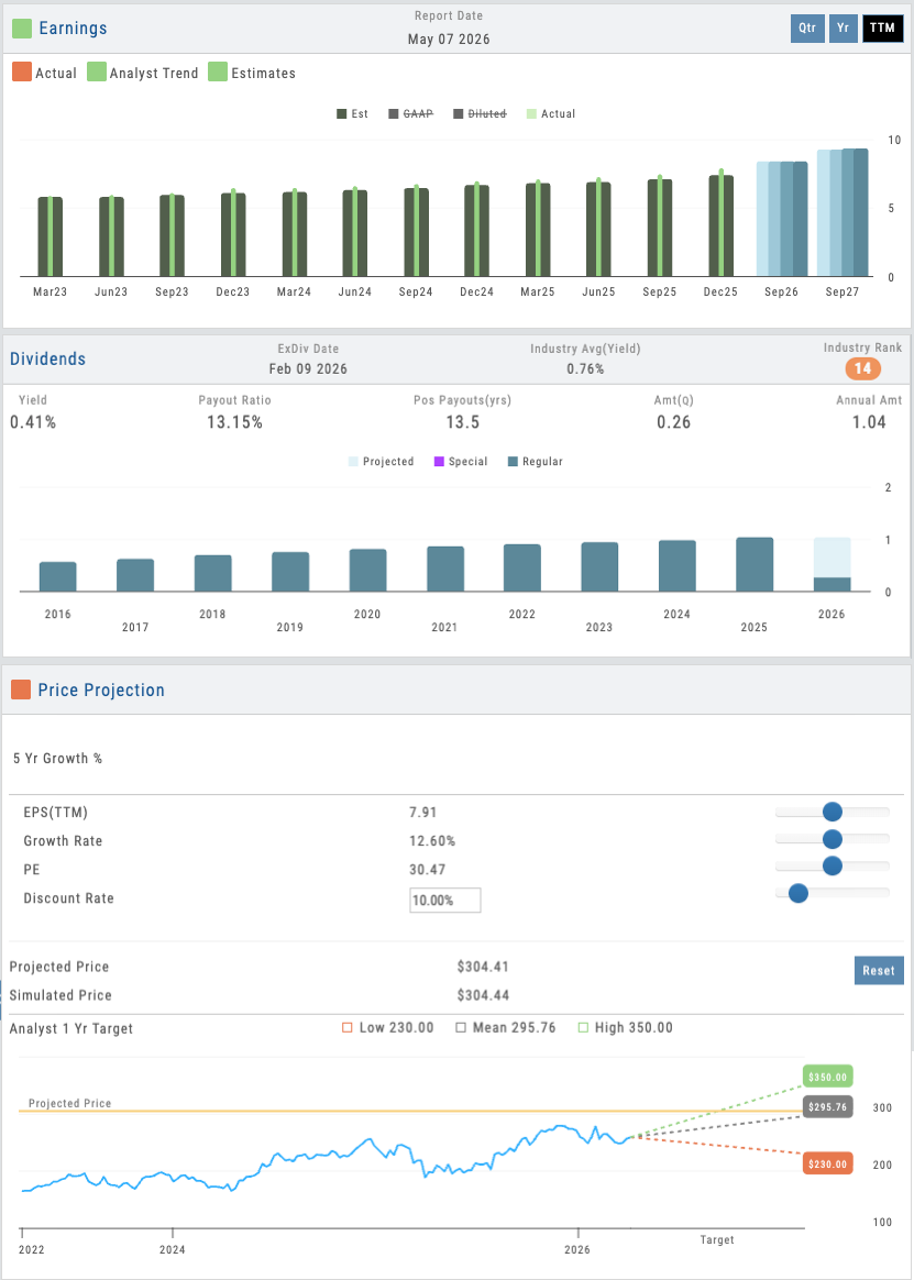
Interactive simulation showing adjustable EPS, Growth Rate, PE, and Discount Rate with live projected price
04 — Dividends & Valuation Modeling
Earnings, Dividends & Interactive Simulation
Analyst price projections, earnings history, dividend quality tracking, and a user-adjustable valuation model on the fly.
The Earnings & Valuation section shows analyst consensus price targets, historical earnings beats and misses, and forward guidance. The Dividends view lets users track dividend quality over time — see the payout ratio to understand how much of its earnings a company is sharing with shareholders, whether dividends are growing or stagnating, and how sustainable the current yield really is.
But the interactive simulation is where users become analysts themselves. Adjust expected EPS growth, projected PE ratio, discount rate, or growth rate — and watch the fair value estimate update in real time. This isn’t a black-box valuation. It’s transparent. Users see exactly how each assumption flows through to price. When they debate whether a stock is fairly valued at $50 or should be worth $65, they can build the case visually. For educators, this is a powerful teaching tool: students learn valuation methodology by experimenting with assumptions. For all users, it turns passive research consumption into active analytical work.
- Analyst consensus price targets and historical estimates
- Earnings history with actual vs. estimated results
- Dividend quality tracking — payout ratio, growth trend, and yield sustainability
- User-adjustable simulation: EPS, growth rate, PE, discount rate
- Real-time fair value calculation based on inputs
- Transparent methodology showing exactly how value is derived
05 — AI Research
AI-Powered Research Assistant
Ask questions about any stock conversationally. Real AI integration with sourced answers — not a chatbot badge.
The AI Analyst is available on every research page. Ask it anything about the company you’re researching: “Why did earnings miss guidance?” “What are the biggest risks to valuation?” “How does this company’s debt load compare to peers?” The AI reads the underlying data — financial statements, conference call transcripts, SEC filings, industry data — and responds with a sourced answer.
This isn’t a generic chatbot. It’s research-specific AI that understands the data it’s analyzing. Every answer includes citations so users can verify claims and dive deeper. And because it’s part of iVest+, your users experience it as part of your platform’s intelligence — not a third-party add-on. One of 8 AI-powered features throughout the platform that deepen research capability and accelerate decision-making.
- Ask questions about any company, sector, or metric
- AI reads financial data, transcripts, SEC filings, industry reports
- Sourced answers with citations for verification
- Available on every research page for instant analysis
- Part of 8 integrated AI features across the platform
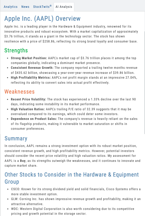
AI Analyst panel showing conversational query and sourced research response
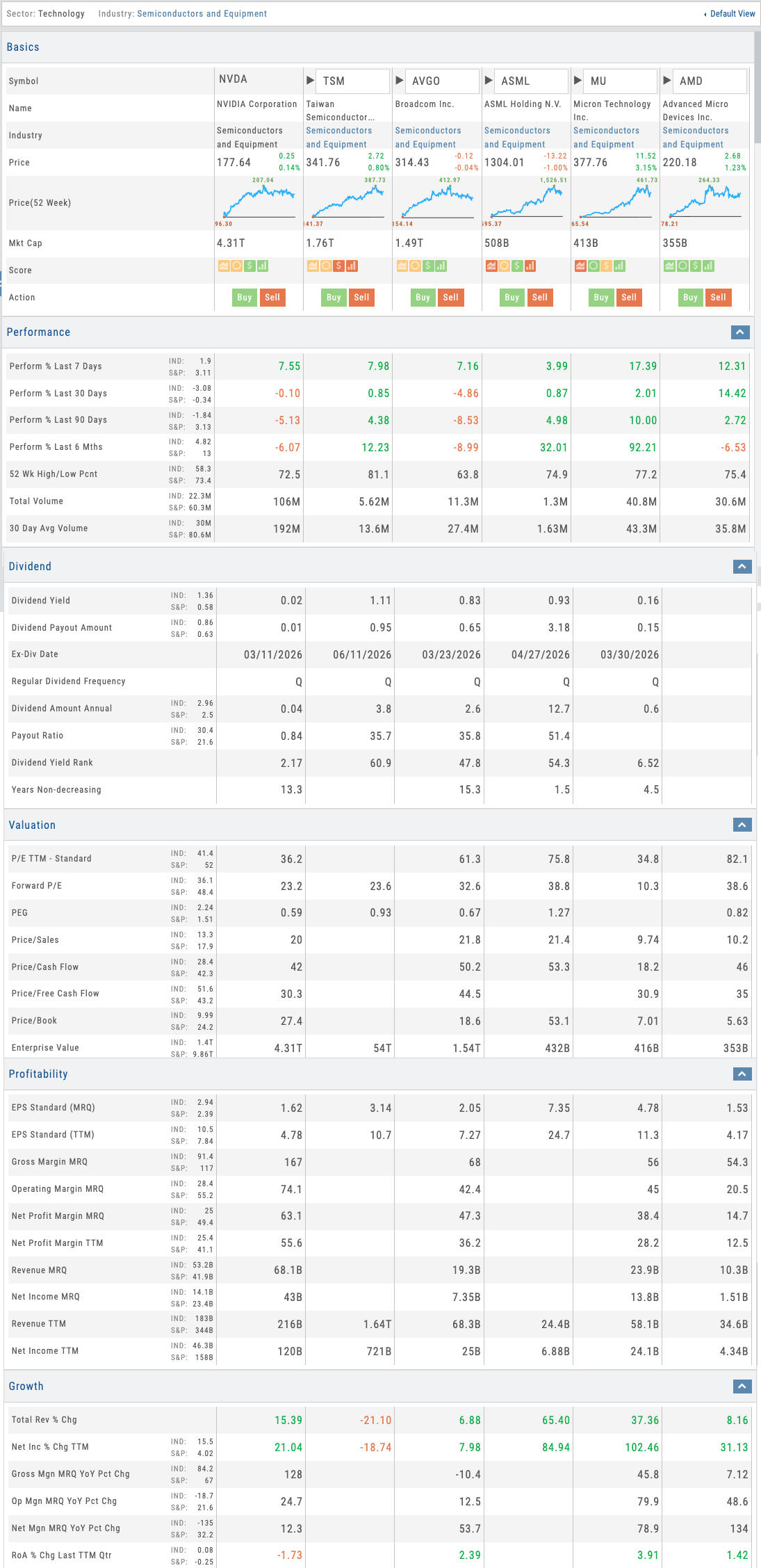
Compare view showing 6 stocks with spark charts, scores, and multi-section analysis
06 — Multi-Stock Compare
Compare Up to 6 Stocks Across Every Metric
Side-by-side comparison with spark charts, 4-point scores, and deep section analysis — with customizable views.
The Compare tab lets users add up to 5 stocks alongside their selected symbol for a 6-stock side-by-side comparison. At the top level, each stock shows a spark chart marking the 52-week high and low and the current 4-point proprietary score. Below, the comparison breaks into deep sections: Performance, Dividend, Valuation, Profitability, Growth, Efficiency, Cash Flow, Insider and Institutional Activity, Options Activity, and Statistics.
Like Key Ratios, Compare includes the same customizable views — Balanced, Swing Trader, Position Trader, Investor — and partners can build their own. Students comparing Apple to Microsoft to Google don’t need to see all 10+ sections at once. They see the comparison through the lens their educator set up. It’s the fastest way to evaluate a basket of stocks and make relative decisions.
- Compare up to 6 stocks side-by-side across 10+ analysis sections
- Spark charts with 52-week range and 4-point proprietary scores
- Customizable views: Balanced, Swing Trader, Position Trader, Investor
- Partners create custom comparison views for their audience
07 — Visual Financial Analysis
Fundamentals — Visual Analysis for Everyone
Earnings, dividends, analyst projections, price simulation, and full financial statements — all presented visually first, with drill-down to the raw data.
The Fundamentals tab gives users access to earnings history, dividend data, analyst price projections, and a future price simulator — plus the complete P&L statement, balance sheet, and cash flow statement. But here’s what makes it different: all of this data is presented visually first for fast analysis and easy trend identification. Users don’t need a finance degree to spot whether earnings are growing, margins are compressing, or debt is rising.
The full financial reports are available on drill-down for users who want the raw numbers. But the visual layer is the default — charts, trend lines, and color-coded indicators that make fundamental analysis accessible to everyone. This is Visual Analysis for people who aren’t in finance, and it’s exactly what education-focused partners need. Your students engage with fundamentals because they can see the story, not just the spreadsheet.
- Earnings, dividends, analyst projections, and price simulator on one page
- Full P&L, balance sheet, and cash flow statements on drill-down
- Visual-first design: charts and trends before raw numbers
- Accessible fundamental analysis for non-finance audiences
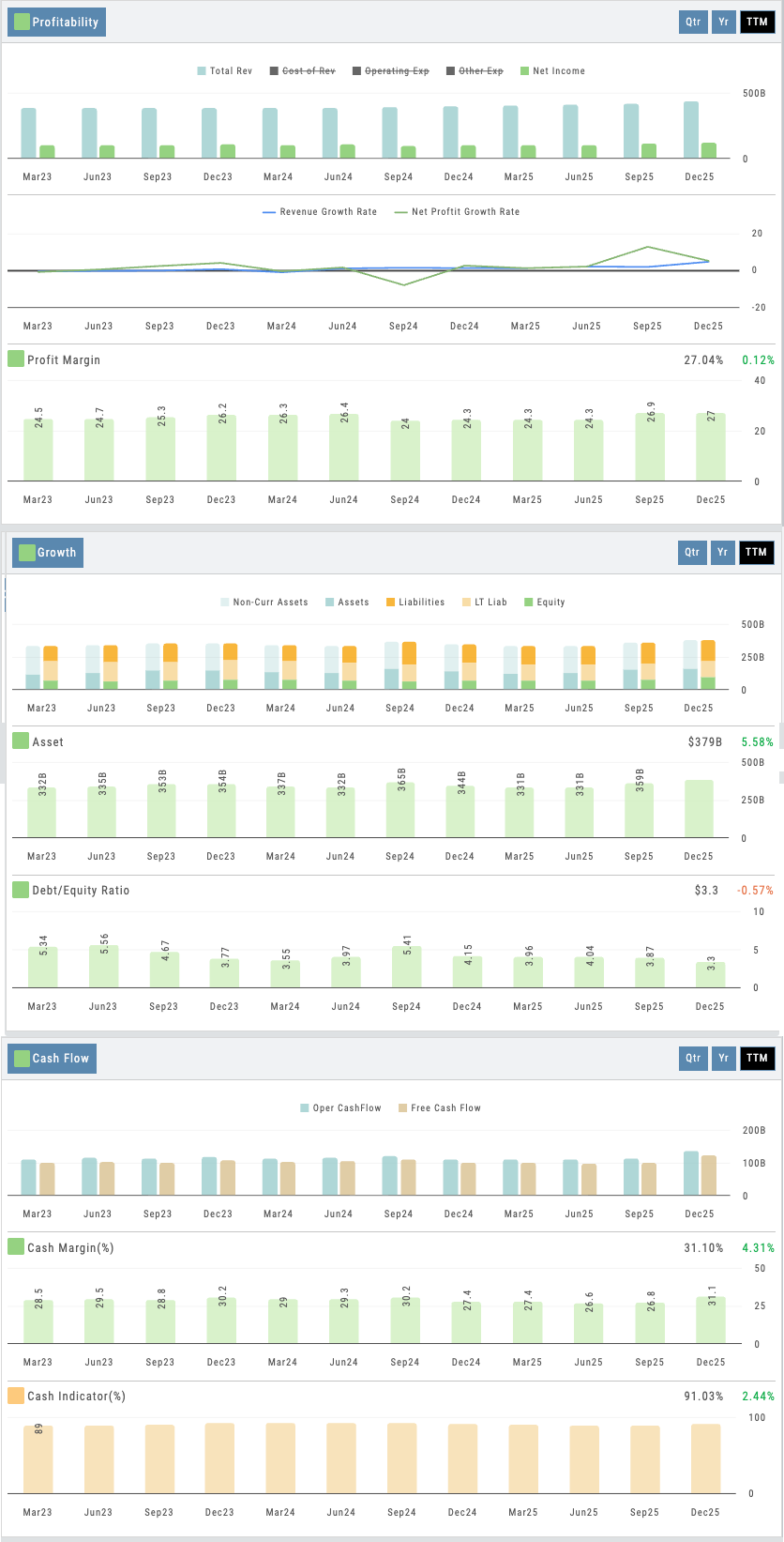
Fundamentals view showing visual earnings, margins, and growth trends with drill-down to full statements
The Activity tab rounds out the research experience — pulling together news, StockTwits social sentiment, AI-powered stock analysis, and the user’s own journal history for each symbol. Users see every trade they’ve ever made on a stock alongside current market context. Research and trading history in one view.
Proprietary Research Under Your Name
Four proprietary scores. 100+ key ratios with customizable views. 6-stock comparison across every metric. Visual financial analysis anyone can use. News, social, AI analysis, and journal history per symbol. 8 research sub-tabs. 25,000+ companies. AI-powered analysis. All deployed as part of your branded platform. Your users get research depth that keeps them coming back. Your competitors won’t be able to match it.
A Video Built for Your Business
Not ready for a call? Tell us about your business and we’ll record a video of the platform built around it — your audience, your asset classes, the tools your members would actually use. No generic demo.
Ask a question
Ask anything about the platform, the partner model, or how a deployment works. A real person answers — no bot, no drip sequence.
Connects to leading brokerages including Schwab, Tradier, and more. See all supported brokers →